Competitors
12
🚀
Discover 50+ More Competitors
This is just the tip of the iceberg. Unlock comprehensive insights into your competitive landscape.
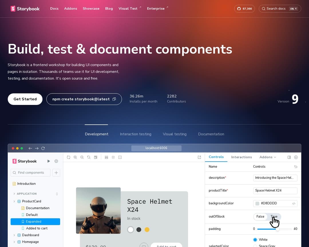
Unlock Full ReportStorybook is an open-source frontend workshop for building, testing, and documenting UI components in isolation. It helps developers create durable user interfaces, mock edge cases, and integrate with various development tools. It also facilitates UI testing and documentation, allowing teams to share how their UI works.
4 of 5
Centralized Asset Storage
Brand Guideline Editor
Shareable Brand Guide URL
Asset Organization & Search
Version Control & Updates
4 of 13
Customizable Sections
Preview Mode
Real-time Collaboration
Integration with Design & Dev Workflows
Logo Variant Upload
Color Palette Definition
Typography Settings
Google & Custom Fonts
Asset Generation Tools
Browser Extension Access
AI Consistency Checker
Automated Notifications
Whitelabel Agency Mode
Storybook is primarily a frontend workshop for building UI components in isolation, focusing on development, testing, and documentation for developers. While it allows for documenting UI components and sharing them, which can be seen as a form of brand guideline, it's not a dedicated brand guideline and asset management platform like ybrand. It lacks explicit features for centralized asset storage of general brand assets (logos, fonts, images beyond UI components), color palette definition with specific values (HEX, RGB, CMYK), and typography settings in the context of a brand guide. Its 'documentation' and 'sharing' features align somewhat with 'brand-guideline-editor' and 'shareable-brand-guide-url', and it offers 'customizable-sections' and 'preview-mode' for its component documentation. The 'integration-with-design-workflows' is also present through its extensive addon ecosystem.
I've been using Alternative A for 6 months now and it's been fantastic. The pricing is much better and the features are actually more robust than what [Product] offers.
It handles edge cases much better and the API is actually documented properly.
Check it out at our site.
Honestly, after trying both, Competitor B wins hands down. Better customer support, cleaner interface, and they don't nickel and dime you for every feature.